
YouTube Shorts Best Practices 2026: Hooks, Posting, Retention
Short Answer
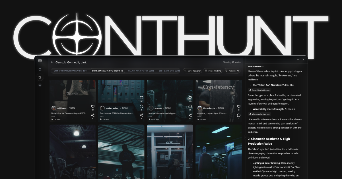
The safest YouTube Shorts playbook in 2026 is still straightforward: open fast, keep every cut purposeful, and review retention before scaling a format. **ContHunt** is most useful when you compare your own Shorts against the strongest posts in your niche instead of copying generic platform advice.
YouTube Shorts Best Practices 2026: Hooks, Posting, Retention
If your Shorts are already getting impressions, the next gains usually come from packaging and retention discipline, not from publishing more often. In 2026, the creators who improve fastest are the ones who review the opening frame, title promise, and audience fit every week.
Quick Take
- Hook the viewer immediately with a clear promise or result preview.
- Keep the pace tight enough that every cut earns its place.
- Use titles, covers, and descriptions as part of Shorts discovery, not as afterthoughts.
- Review retention, rewatches, and first-hour response before you scale any format.
YouTube Shorts Complete Guide
If you came here from the old youtube-shorts-complete-guide page, the basics now live here.
- A Short is a vertical video built for fast discovery, usually with a strong opening and a single clear idea.
- Creation and upload still matter, but the first-frame promise matters more.
- Keep the title, caption, and on-screen text aligned so the platform knows exactly who the Short is for.
- Use this page as the operating guide, then pair it with analytics and content-ideas pages for deeper execution.
1. Start With a Better Hook
The strongest Shorts usually answer one question right away: why should the viewer stay?
Practical ways to do that:
- show the outcome first
- state the payoff in plain language
- open with movement or contrast that supports the idea
- remove any setup that delays the point
Weak hooks usually fail for one of three reasons:
- the opening is visually flat
- the first line is vague
- the video starts with context instead of value
ContHunt Tip: Save your best-performing first-second patterns in a small hook library so you can reuse structures without repeating the same script.
2. Improve Retention Before You Increase Volume
More uploads do not fix weak retention. If viewers drop early, posting more often usually multiplies the same problem.
Focus on:
- faster payoff
- tighter edits
- simpler sequencing
- fewer side points per Short
One useful review process is:
- Watch the Short without audio.
- Watch it again and stop at the first moment attention slows.
- Ask whether that moment adds value or just adds time.
If a Short needs a long explanation, it may be better as a sequence, a longer video, or a related follow-up.
3. Match Format to Search and Feed Discovery
Shorts can gain traffic from the feed, search, related videos, and channel browsing. That means packaging still matters.
For stronger discovery:
- use a title that says what the Short helps with
- keep the topic specific enough to match a real use case
- write descriptions that support the topic instead of repeating buzzwords
- connect the Short to related content when relevant
If you need a deeper timing workflow, read Best Time to Post YouTube Shorts in 2026.
4. Use Covers and Titles to Reinforce the Promise
Even when a viewer first meets your content in the Shorts feed, titles and covers still affect how the post performs outside that first swipe.
Good titles usually do one of these:
- promise a specific result
- identify a clear mistake to avoid
- frame the content as a direct answer
Good covers usually do one of these:
- repeat the promise visually
- highlight the result
- stay readable on a small screen
If you are also refining packaging, YouTube Shorts Thumbnail Best Practices 2026 is the next page to review.
5. Build a Repeatable Publishing Cadence
The right cadence is the one you can maintain while still learning from each upload.
A practical baseline:
- test 3-5 Shorts per week
- keep the topic cluster tight
- review performance weekly
- double down only on formats that show repeatable strength
That gives you enough volume to learn without turning your channel into a content dump.
6. Use Retention Loops Carefully
A loop can help rewatches, but it does not rescue a weak idea. It works best when the ending naturally reconnects to the opening.
Examples:
- the final line resolves the first line
- the last frame matches the first frame
- the viewer needs one more pass to catch the payoff
What to avoid:
- fake cliffhangers with no payoff
- loops that feel accidental
- endings that repeat instead of resolve
7. Review the Right Metrics
For most Shorts creators, these metrics are more useful than vanity totals:
- first-hour response
- average percentage viewed
- rewatches
- saves and shares
- repeatable topic winners
Use YouTube Analytics and your own tracking to compare not just individual winners, but patterns across winners. That is where ContHunt can help most: identifying which hook, structure, and topic combinations actually repeat.
For stronger measurement, see YouTube Shorts Analytics.
8. Keep the Advice Grounded in Your Niche
Generic Shorts advice breaks down when it ignores audience type. The right pacing for gaming, education, commentary, and product demos is not identical.
Before scaling a format, ask:
- who is this Short for?
- what promise is it making?
- what topic cluster does it belong to?
- what similar posts already worked for this audience?
That keeps your experimentation focused and reduces random topic drift.
Checklist
- [ ] The first second makes a clear promise
- [ ] The edit removes dead setup
- [ ] The title matches the actual payoff
- [ ] The cover supports search and browse discovery
- [ ] The posting rhythm is sustainable
- [ ] Retention is reviewed before copying the format again
- [ ] Related Shorts are linked through topic clusters, not just hashtags
Conclusion
The best YouTube Shorts strategy in 2026 is not a secret publishing hack. It is a disciplined process: stronger openings, tighter pacing, clearer packaging, and honest review of what your audience actually finishes. Use ContHunt to compare winning patterns inside your niche, then build a repeatable system instead of chasing one-off spikes.
Key Data Points
Opening Window
First 1-2 Seconds
Your opening frame and first spoken line need to establish a reason to keep watching.
Cadence Baseline
3-5 Shorts/Week
A repeatable publishing rhythm usually teaches more than inconsistent bursts.
Review Focus
Retention + Rewatches
Use these signals to decide which formats deserve a second or third iteration.
Sources
- Enhance your Shorts · YouTube Help
- Understand your YouTube audience · YouTube Studio App Help Center
- How engagement metrics are counted · YouTube Studio App Help Center